Projects
Die Parts Replacement Dashboard
-
The first slicer "Side" lets the user pick which side of the molding die set to analyze with each of its specific total die parts replaced that are distributed individually.
-
Then, the user can pick a specific die part to analyze using the second slicer "parts".
-
After the user have chosen a specific die part, the second light blue bar chart (i.e., Cavity Distribution) shows the quantity distribution per cavity of the parts replaced.
-
Now, the user can pick the cavity most affected using the slicer "Cavity" with choices from letters A to H; to identify the life cycle of the specific die part chosen on that specific cavity.
-
Also, the remaining light red graphs (i.e., Total Parts Change Trend per Cav, Monthly Total Parts Change Distribution, and Total Parts Change Distribution) shows the total parts change trend, the distribution of parts changed per month, and the total distribution of the parts changed for the specified cavity using the third slicer.
-
For the Monthly Total Parts Change Per Cavity table, the fourth slicer "Month" is used to show the performance of each cavity per month based on the total count of parts changed for the month chosen.
-
Lastly, Total Parts Change % Distribution table shows the totality of all the parts changed distributed to each cavity, and the Monthly Total Parts Change Trend table shows the totality of all the parts changed distributed monthly.
Overall Equipment Effectiveness Dashboard
The report connections on the slicer "OEE by Month" is integrated to all bar charts inside the window which shows the trend by week of important KPIs to be monitored
-
Availability
-
Performance
-
Quality
-
Overall OEE
-
Down Time
-
Fully Productive Time
-
All Time
-
Planned Production Time
-
Run Time
-
Utilization
-
TEEP
Finally, the slicer "OEE by Week" is integrated to all donut charts which shows and visualize the specific value of the KPIs with their specified target value below.
Defect Management Dashboard
Pareto Chart - Shows the most occurring defect type per month
Pie Chart - Displays the percent distribution of defect types per month
Restaurant Digital Progect
Statistical Software: MINITAB 17
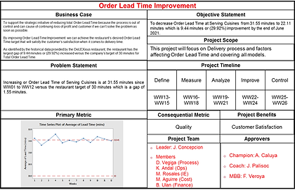
This project utilizes the DMAIC disciplined approach of lean six sigma to improve order lead time of DeLEXious restaurant cuisines.
-
Define Phase
-
Identified that British and American Cuisines are the target for improvement using Pareto
-
Critical to Quality Tree (CTQ tree)
-
SIPOC Diagram
-
Project Charter
-
Stakeholder analysis and Communication Plan
-
Cost-Benefit Analysis
-
-
Measure Phase
-
Deployment Process Mapping
-
Cause and Effect Analysis
-
Potential X’s Prioritization
-
-
Quick wins
-
Process Capability Analysis
-
Gage R&R
-
Attribute Agreement Analysis
-
-
Analyze Phase
-
FMEA Generation
-
Validation Plan
-
Hypothesis Testing
-
One way ANOVA
-
Chi Square Test
-
-
-
Improve Phase
-
Corrective and Preventive Actions
-
Implementation Result
-
-
Control Phase
-
Process Control Plan / Standardization/Documentation/Fan-Out
-
Project Transition
Action Plan -
Final Financial
Computation
-